%20(4000%20x%204000%20px).png)
Butler Sporting Goods
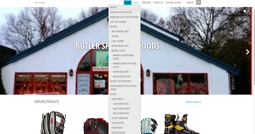
Butler Sporting Goods is a local sports equipment and apparel store in Barnstable, MA. Serving a loyal customer base on Cape Cod for over 40 years, Butler prides itself on offering the personal touch that other name brand giants – like Dick’s Sporting Goods or Marathon Sports – do not. As such, their website is simple and minimalist. Unfortunately, the site navigation is correspondingly primitive and cluttered. I wanted to clean it up and hopefully add a little life to the interface…
Client: Butler Sporting Goods
Timeframe: 2-week design sprint
Objective: Website redesign
Role: Information Architect / Visual Designer
Team: Solo project
Tools: Figma, Google Workspace
The Ask
The Butler Sporting Goods website required improvement in several areas, but the main area of concern for this project was primary navigation.

The Challenge
The Butler Sporting Goods website was (and is) simple by design, encouraging customers to buy athletic equipment and apparel, without any superfluous frills. Therefore, in redesigning and reorganizing the site’s primary navigation, I wanted to maintain the character of the interface, but clean up the clutter. In addition to rearchitecting the navigation, I also enacted a number of visual design alterations – adding color in places and ensuring clear differentiation between page areas (i.e. header, footer, etc.).
The Process

-
Competitive + Comparative Analysis
-
By comparing Butler Sporting Goods to industry competitors – Marathon Sports, Dick’s Sporting Goods and Eastern Mountain Sports (EMS) – and analogous small businesses – KANDY KORNER – I was able to see a clear difference in the approaches taken by large and small businesses. For example, while Butler Sporting Goods and KANDY KORNER do not offer “chat” or “Account” features, both small businesses do offer customizable / personalizable products. Sometimes, small businesses are able to succeed not by competing with the big name brands, but rather, by changing the game and leaning into their own strengths.
-
-
Heuristic Evaluation
-
By conducting a heuristic evaluation of the Butler Sporting Goods website, I was able to determine the specific strengths and shortcomings with regards to Learnability, Efficiency, Memorability, Errors and Satisfaction. I learned that the fundamental navigation was an issue, as were incomplete item descriptions and delayed “out of stock” notifications, among other things.
-
-
User Interviews
-
I conducted 4 interviews. In order to ensure that I was collecting information from the most relevant users, I made sure to focus my efforts on individuals with an interest in athletics and/or fitness on some level. Once I knew each interviewee fell within the target user base, I asked them questions about their online and in-person shopping habits. Specifically, I wanted to know their process for finding and purchasing sports apparel and equipment, as well as what information and features on websites made for the best user experience.
-
Key Takeaways:
-
Users prefer shopping locally, when possible.
-
Users take time to find the right item.
-
Users value tactile understanding of products - e.g. weight, size, texture.
-
Users do not prioritize product personalization.
-
Users value reviews and descriptions, but are repelled by too much information.
-
-
-
-
Card Sort
-
To reorganize the navigation schema, I engaged 4 users in a card sorting exercise, asking each to redistribute and relabel existing Butler Sporting Goods menu items in a way that they thought made sense. This step was invaluable.
-
-
Site Map
-
From the results of the card sorting exercise, I was able to develop a cleaner site map. By reformatting the header and footer, I made room for sports-specific menu headers, which improved the navigation’s learnability.
-
-
User Flow
-
As the site had few steps from start to finish – homepage to checkout confirmation – the user flow needed little editing. Nonetheless, I made some minor changes, like ensuring that “Keep Shopping” navigated to the "Shop" page, not home, and presenting the option to “Keep Shopping” after checkout confirmation.
-
-
Sketches
-
Sketching allowed me to represent my initial layout ideas for the site redesign, before developing grayscale wireframes.
-
-
Wireframes
-
From the initial design previously sketched, I created grayscale wireframes in Figma. These digital screens helped me improve the precision with which I placed elements on the page, especially using 5-column gridding.
-
-
Mid / hi-fidelity Prototype
-
From the foundation of wireframes, I moved on to adding color to the screens, initially choosing blue and green for page section backgrounds and yellow for CTA buttons. With color added, I began usability testing.
-
-
Usability Tests
-
With the mid / hi-fidelity prototype for my redesign of Butler Sporting Goods’ website, I conducted usability tests with 2 users - both of whom were not familiar with Butler and neither of whom had been interviewed for the project before. Instructed to perform several tasks on the prototype – like navigating from the homepage through to checkout completion and adding an item to their cart from the “Shop” page – both users provided valuable feedback.
-
-
Redesign
-
Based on feedback from initial usability tests, I altered the color scheme of the interface, incorporating the brand colors of Butler Sporting Goods (maroon and black) instead of the blue and green. In addition, some of the CTA buttons were not easily noticed, so I improved their visibility.
-
The Solution
A clear, intuitive website navigation experience for Butler Sporting Goods customers.

The Reflection
Upon review, and from second round usability feedback, I learned that – while the navigation and overall shopping journey was improved – some users were drawn to the colored areas of the page, instead of the menu and/or products. Despite the minor distraction, 100% of users were able to successfully navigate through to checkout completion. However, only 33% were then able to successfully navigate back to the shop page from the checkout confirmation - evidently the “Keep Shopping” button was not obvious.
Were I to revisit this project, I would look to direct the users to the menu and product elements. In addition, while the Butler Sporting Goods site is functional, it is fairly primitive. A “Create Account” feature would help generate even greater customer loyalty and streamline the process for repeat visitors.